Best Practices for Responsive Web Design
The pace of device development became relatively fast, and the screen size, resolution, and interface diversity became quite challenging. As a developer, you have to focus on a web app or website that works perfectly with different browsers and screen sizes. In this blog we provide a best practices for responsive web design.
Device switching is now quite common as a person can access your website on a computer at home but access it through a mobile device when he goes for a walk. You should adopt different methods to render content according to screen size.
Creating different website versions and rendering them by detecting browser and device screen sizes is one way to solve the responsive web design problem. But browser and screen size detection are error-prone, and building and maintaining different versions of the same website will become a nightmare for you as a developer.
It’s usually better to create a version of your website that doesn’t care about screen sizes and browsers. Instead, it uses methods to detect supported features, then adjusts the code and renders the website according to the screen size without affecting its user experience and optimization.
What is Responsive Web Design?
Responsive web design (RWD), also known as Responsiveness or responsive design, is an approach to building a website that dynamically changes appearance according to the screen size and viewing device’s orientation. RWD is a way of creating a website that adapts to device screen sizes such as a tablet, mobile, desktop, etc.
Responsive Web Design is more reliable, maintainable, and future proof than maintaining different website versions for different screen sizes and platforms. RWD responds to screen changes by adjusting browser width, content placement and design adjustments to fit the website with the given screen size.
If you know little about software engineering and web development, then you might be aware of the media queries, fluid layouts and responsive images that make your website adapt independently.
Best Practices for Responsive Web Design
Media Queries
Media Queries is a feature provided by CSS3 which allows us to apply CSS styles based on screen size and resolution. The media query first detects the screen size and then selects the CSS styles according to the size and resolution. Screen size, orientation, browser and resolution are considered before writing the media queries.

Media queries use an approach where the website’s layout is changed and rendered based on the screen resolution and size. It allows us to build a responsive website that applies styles based on screen sizes, such as small screens, big screens, or anywhere in between.
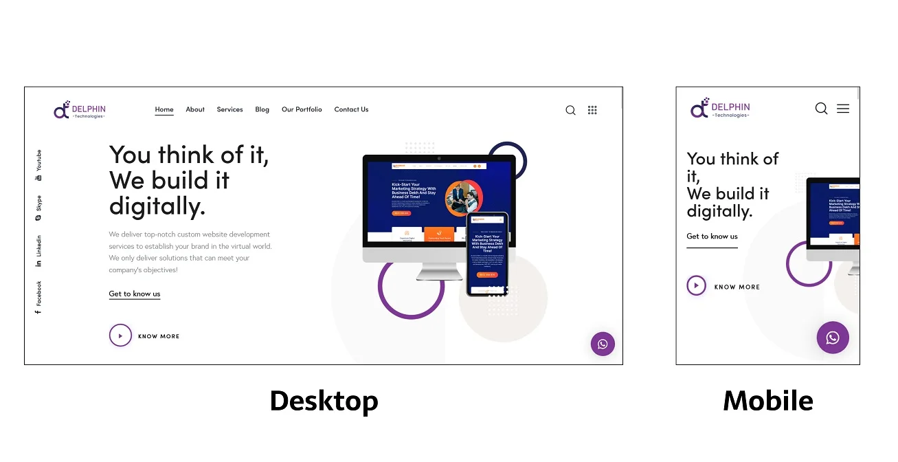
The image below illustrates our website, where you can see the different web layouts and designs for desktop and Mobile screens.
Media queries are used to instruct the browser to rearrange the layout and adapt the design according to the screen size. If the screen size is smaller than the particular size, then specific CSS styles will be applied to the website. The point where the website breaks the change in its layout is called the breakpoint.
Media query works similarly to the programming concept “if clause”. Basically, it checks for the screen viewport size and then executes the appropriate code according to the screen size.
@media screen and (max-width: 560px) {
img {
margin: 20px;
width: 90%;
}
If the screen size is less than 560px, apply this CSS style, which adds a 20px margin on all four sides of the image and will take 90% of the screen automatically.
Similar to the max-width media query, there is also a min-width query:
@media screen and (min-width: 560px) {
img {
margin: 40px;
width: 70%;
}
If the screen size is greater than 560px, then apply this style, which adds a 40px margin on all four sides of the image and will take 70% of the screen automatically.
There is plenty of media queries value are available such as:
- width (min-width, max-width)
- height (min-height, max-height)
- orientation
- aspect-ratio
The best approach to building a responsive web design is to follow the “mobile first” approach, where you create the web design for a mobile screen first and then scale up from there to the wide screen size devices.
Responsive Images
Responsive images adjust the height and width according to the screen size, and it follows the concept of dynamic control of the width and height depending upon the screen sizes and viewport.
Dynamic units are used to control and automatically adjust to fit the dimensions of the screen image. An image with fixed width and height dimensions causes scrollbars if the viewport or screen size is less than the image dimensions.
Using the % percentage units, you can control the behavior of the image. For example, if the screen is 1000px, then adding 70% of the width of the image means 700px of width.
img {

Width: 70%

}
The 70% width is calculated based on the screen size or viewport of the device.
You can combine media queries with dynamic units to adjust the image’s responsive properties and fit or scale the image according to the device screen or viewport.
Fluid layout
Fluid layout is an essential part of responsive web design, which solely depends on the screen size and the screen’s viewport. Building fluid layout means taking an approach that will dynamically and automatically increase or decrease the size of the container element depending upon the viewport of the screen size.
The fluid layout relies upon dynamic units such as percentages of the screen size or the viewport.
In the image below, you will see that Container A takes 70% width of the screen size or the screen viewport, whereas Container B takes 30% width.

The percentage values depend on the total width of the screen. Suppose the screen width is 1000px. Then Container A width will become 700px, and Container B width will become 300px. The values are dynamically adjusted based on the total width of the screen size.
We can create a similar layout using the CSS Styles width property and the percentage unit.
.containerA {
    width: 70%;
}

.containerB {
    width: 30%;
}
Relying solely on the fluid layout is never the best option, so combine fluid layout and media queries to adjust the alignment of container elements vertically or horizontally as the screen size gets larger or smaller.
Setting up the Viewport
The website must include the meta viewport tag in the head of the website HTML document because it helps to optimize the website according to the screen size. The meta viewport tag controls the browser to control the website dimension and scaling.
With the help of the meta viewport tag, the browser controls the font sizes by scaling content according to the screen size.
You must add the below meta viewport tag inside the head of the HTML document:
<meta name=”viewport” content=”width=device-width, initial-scale=1″>Conclusion
Creating a website is not the most challenging task, but optimizing the user experience and responsive web design requires attention to small details. It is easy to make small mistakes that can affect thousands of users with specialized screen devices.
But understanding the key issues and following best practices will help you to make a website responsive on all screen devices. The future of web design is screen independent, not screen-agnostic.
If following all these practices sounds hard to achieve, hiring a web design agency is better. If you are looking for someone to assist you with web design, then delphin technologies will be pleased to help you. Delphin Technologies have a lot of experience working with clients with 100% satisfactory results and even did web design in Chicago for the various clients and startups.


Grovy Optiva, A-5, Block-A Sector-68,
Noida-201301 Uttar Pradesh, India

712 H St NESte 1735, City: Washington, State: DC, ZIP Code: 20002

Compass Building, Al Shohada Road, Al Hamra Industrial Zone Ras Al Khaimah, United Arab Emirates

Unit 1603, 16th Floor, The L. Plaza, 367 - 375 Queen's Road Central, Sheung Wan, Hong Kong


